COGS 108 UCSD Project!
Table of contents
COGS 108: Data Science in Practice
This page is dedicated to COGS 108: Data Science in Practice. It is a course held for Undergraduates at UCSD. This page will showcase the quarter-long project (using Jupyter Notebooks and Python) that my team and I worked on together. Here is a bit of background information about our chosen topic…
This segment of the Portfolio was done in a group with no one else’s names being visible on any of the documentation. I (hopefully) remembered to remove any unwanted names and contributions. Please contact me if you are concerned with anyone’s name being on the Project.
Overview of this Project:
Research Question
Did California Air Quality significantly improve in different areas due to the COVID-19 Pandemic and the change in car traffic volume?
Hypothesis
We hypothesize that COVID-19 has had an overall good effect from 2020-2022 on Air Quality based on AQI (Air Quality Index). We think that the pandemic has led to more WFH (work-from-home) and remote opportunities for the general population of California, thus changing the amount of air pollution caused by a reduction in car traffic via commuting. We acknowledge that there may be some confounding variables including regional industries, population per capita, and lockdown restrictions_
Ethics and Privacy
Want to know more about this aspect? Feel free to find the Github Repository here!!
Style of the Project:
After getting our Research Question and Hypothesis…
We then had to go finish all 4 checkpoints by certain due dates.
- Project Proposal: The Research Question was the first thing our group had worked on. Air Quality (AQI) and the change in improvement or lack thereof due to the COVID19 Pandemic in the state of California specifically. We looked into research and data that talked about each of the individual components in regards to AQI measures, COVID years, and overall vehicular traffic.
- Data Checkpoint: The next step was the Data Checkpoint where we finished gathering data and datasets. We then were able to actually start the Data Setup process and Data Cleaning. This was when things got to be super fun!! Data collection and cleaning using Python and Jupyter Notebooks.
- EDA Checkpoint: Next we got all our data we collected, and started analyzing the results of our data connections and correlations. We were able to create different data visualizations using Pandas, and Seaborn through Jupyter Notebooks and Python.
- Final Project and Video: Finally we tied it all together, did some more analyses and data correlations with different Linear Regression models and got our final result!!
Images and Data Visualizations
To make it easier to navigate and for others to understand easier, I have provided PNG versions of the Data Visuals as well here. 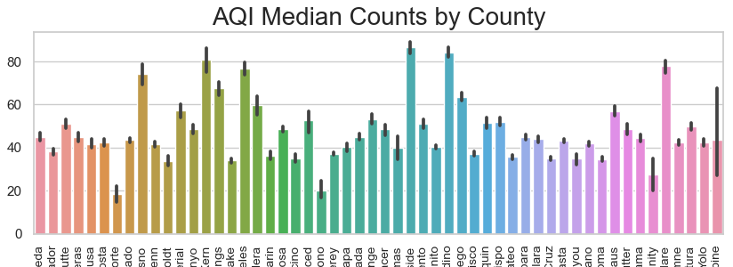
Image 1: A Bar Graph to Show AQI Median Counts by County of CA 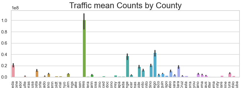
Image 2: A Bar Graph to Show Traffic Mean Counts by County of CA 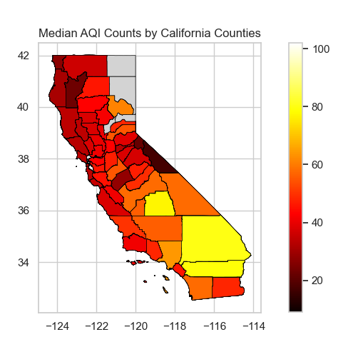
Have any questions, comments, or concerns?
Feel free to reach out anytime to learn more about this project!